A big fan of utility watches, I have always had a keen eye on new innovative products that are entering the market, especially if they have any potential to be a game changer when it comes to form and/or function. Wristop computers, or wearable smart devices if you will, have come a long way from the launch of of the world’s first outdoor watch Suunto Vector back in 1998, packing today an impressive amount of functions for such small gadgets. For me, Suunto, Polar and Garmin are the companies that have been pushing the envelope through the generations of products, and over the last 15 years, I have been happily using products such as the Vector, T6- and Ambit-series from Suunto, S-series bicycle watches from Polar and Edge bike computers from Garmin. While the physical products themselves have improved over time with better design and use of materials such as light composites, stainless steel and mineral and sapphire glass, so have also the software products that are paramount for this type of smart devices. Evolved from executables running on your desktop computer, at times only on Windows OS, today we see them gone all cloudy and social, which is all very welcome, if not completely trouble-free.
As a long time user of Suunto watches, lately the Ambit series, I had been following the launch of the fēnix wristop devices with interest. While the first two generations were entering the market, I kept on using my Ambit2, and later Ambit3, with essentially the same features and functions in somewhat more elegant package. Subjective of course, and up to your personal preferences, using these smart watches, day in and day out, I appreciated the less utilitarian looks of especially the Sapphire versions of Ambit. I was however rather underwhelmed by the marginal improvements over the Ambit generations and disappointed with Movescount, coming from the old Training Manager, I was waiting for something better to come by.
The introduction of fēnix 3 in CES this year raised a lot of positive buzz, with Garmin taking a big leap both in terms of design and functionality, launching a product that was not only, in my opinion, head and shoulders above its predecessor, but one that could outplay the current competition. Eager to find this out myself, Garmin offered me an opportunity to test and review the fēnix 3, and for a month now, I have been putting it to the test, finding out just what this wearable smart device is made of.
From what I can tell so far, I do think it belongs to the top tier, packing innovative ideas that make others appear outmoded. But there is more to it, so read on to find all about it. As usual I will be taking here a more hands on approach, with handpicked highlights and focus points. Hence I will not be discussing the specifications in detail, nor will I be opening the box with you, but I do intend to share with you my honest views and opinions about the product.
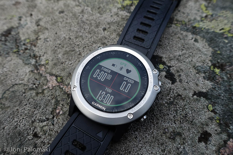
The model I got for testing is the Silver Performance Bundle, including a HRM-Run which in addition to accurately measuring your heart rate, also sports an accelerometer for additional running metrics. Compared to the top of the line Sapphire version, it lacks the sapphire glass display and stainless steel wrist band. While the first is something I have learned to appreciate on my last two Ambit watches, the mineral glass does seem very hard wearing and so far I have not been able to get a single scratch on it, despite being knocked around. The stainless steel bezel, effectively the new omni-directional EXO antenna, is both elegant and hard wearing, and ages a lot better than for example anodized aluminum alloy.
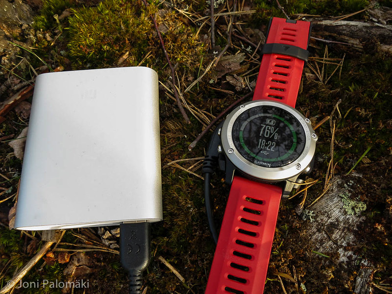
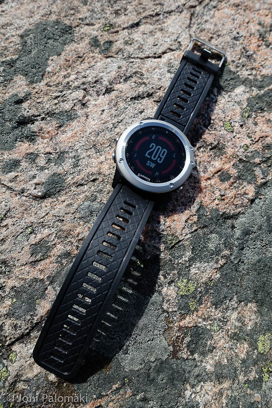
As the watch came with a bright red band, I wanted also something less obtrusive to wear around office. Garmin offers optional bands for fēnix 3, but as at the time they were hard to come by in black, I instead purchased an interchangeable fēnix 2 band. Bands are attached with torx screws that are of different size (T10 on 2 versus T6 on 3), and while the spare comes with a pair of T10 screwdrivers, make sure you also have a pair of T6’s for the original band, as you will be reusing its pin and screws. Fēnix 2 band has a non-slip checker texture and a polished stainless steel buckle that I much prefer over the all black fēnix 3 band.
Taking the watch into use was a breeze, device walking you through some of the basic parameters required - units, height, weight and so on. I switched the language to Finnish, connected the device to my MacBook Pro with the provided USB dock, and installed the connectivity utility, Garmin Express. Once connected, I was able to quickly check for firmware updates, and shortly after had the watch fully up to date and ready to use. I have so far received two updates to the watch, latest one on April 21. Current version, 3.20, as well as the ones preceding it have been performing flawlessly, in other words I have not experienced any erratic behavior or freezing, nor have I had to reset the device at any time.
Garmin Express, aside of managing software updates and data transfer between the watch and Garmin Connect, can also be used to manage Apps on the device. I appreciate the fact that all the settings can be changed in the device itself, even on the go, but for bulk removal (or download) of apps, Garmin Connect is quicker, also to check the available storage space on your device, with maximum of 16 Apps or 512 kB allowed. A complex watch face for example takes about 40 kB.
Having used Garmin devices earlier, I was already familiar with Garmin Connect, the online portal for storage and statistical analysis of your data, and a lot more, which since I last time had logged in had been completely overhauled. Using Safari, I was able to log in without problems, finding the polished interface clean and fully localized, easy to navigate. Packed with various views to your activity (and personal) data, the interface is easily customized to your liking, allowing you to add and remove items as you wish, on each screen tab. After using the very basic and closed Movescount for couple of years, at first Garmin Connect felt even a bit exhausting, in comparison, but I quickly came in terms with it, appreciating the freedom to choose how I view my data. As an example, I rotate the chains on my bike every 1000 kilometers or so, to get more out of the complete drive train. For this purpose, being able to log that in and pull a report over a specific time frame, not just the typical ‘past week’ or ‘past month’ summaries, as a matter-of-fact odometer is essential. Unlike in Movescount where I have been struggling for example with this task exactly, in Garmin Connect this is just a matter of opening a summary report and choosing the time frame and an activity filter. Simple, just as it should be!
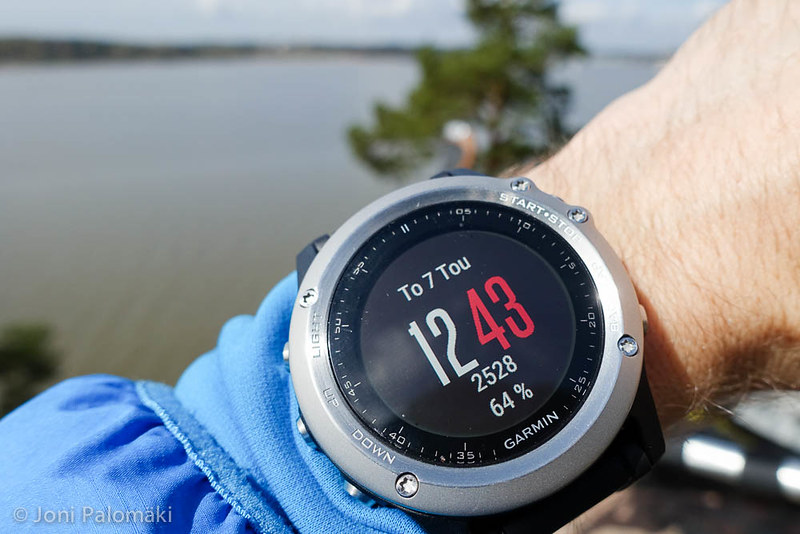
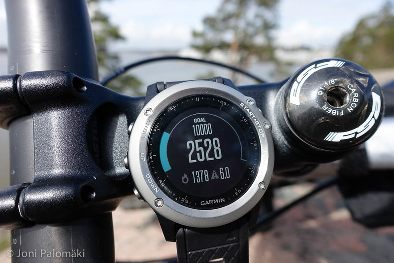
As an everyday wearable, fēnix 3 has proved to be a great companion. I especially like the fact that it tracks movement throughout the day, step counter included, and promptly reminds me during the day to stand up from my desk and move around. Vibration alerts ensure quiet but effective notifications and allow you to turn off all the random blips and beeps otherwise needed, including watch alarm. Watch face can be modified with few built in options and more can be downloaded from Connect IQ store, which I will be discussing more later. Also found from the store, I am currently using Simple Black by usul_, displaying time, date, step counter and remaining battery life in percentage.
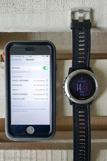
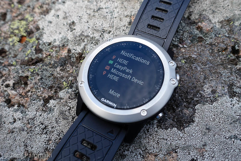
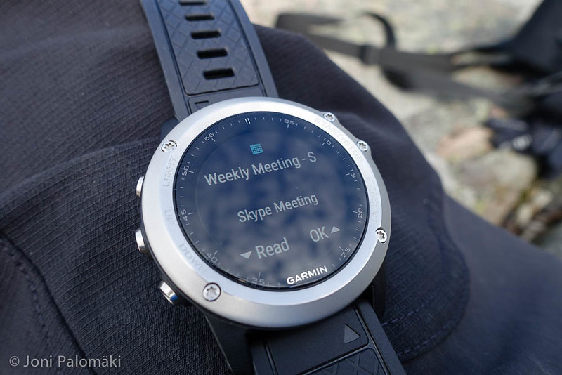
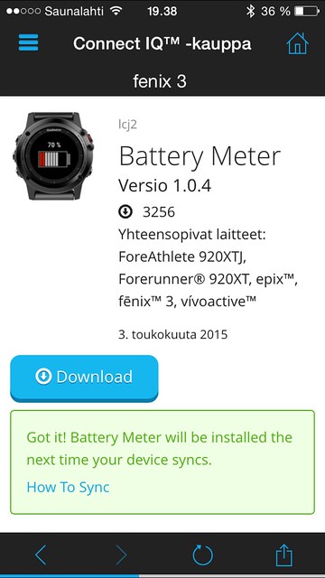
Downloading the Connect Mobile application for my iPhone from the App Store, installation of said watch faces (and other Connect IQ Apps) is simple, and with bluetooth enabled on the smart phone, one can lock on to additional resources such as weather details, notifications (calls, SMS, email and social media), calendar and for example music controls over your smart phone. Reading notifications in the watch, I have not experienced any formatting issues with the different type of notifications. Music controls on the other hand only work within the Music app, which is a pity for us Spotify users. This is, as far as I know, more of Apple’s problem, so Android users might have better luck with it. I am personally more inclined to use activity related widgets and do not actively use for example the weather or calendar widget. Depending on your personal preferences, it is however easy to hide any redundant widget, or download new ones from Connect IQ.
Since fēnix 3 is an activity watch first and foremost, tracking your exercises and adventures, and ability to store an array of data for analysis and statistical purposes, is paramount. Watch comes bundled with a few sport profiles, all of which can be freely, and extensively, customized to your liking. Or deleted to remove clutter, if you so wish. I chose to delete a few and modify the rest to include time as one of the data screen values. I won’t walk through all the different settings available, but for example being able to set auto lapping and various alerts (both with vibration notifications of course) and both accent and background color have proved to be useful. As I mentioned, all the settings, also related to Apps, can be modified in the watch, so updating them on the go is very easy. If you find that you are missing, say, an essential data screen from a profile you are using, or for example want to add an alert, you can do that even while recording an exercise. Smart!
There is, however, a small caveat when it comes to sport profiles currently. There is only ten (10) available profiles to choose from (Running, Cycling, Pool Swimming, Open Water, Alpine Skiing, XC Ski, Hiking, Mountaineering, Multisport and Other), with seven (7) profile icons, and a generic one, to roughly match these profiles. Being an avid packrafter, I obviously wanted to have a profile for paddle sports, but as you can see, that is not on the default list. I tried the obvious thing, creating a new profile using the Other option, and this was all fine, until I used it for the first time and, returning home, uploaded my data to Garmin Connect. As it turned out, the profile icon I had used, a person with a paddle in his hand, was defining the activity type in Garmin Connect. In this case, stand up paddle boarding was picked, with no evidence of my appropriately named ‘Paddling’ profile. At first I was sure I had missed something, but a quick check with helpful Garmin support confirmed that profile icon, if chosen, will define the activity type in Garmin Connect, and currently there is no such icon for paddling. What this means is that in case your activities are something other than the nine listed above, you will need to manually update, once uploaded to Garmin Connect, every single exercise, to reflect the correct activity.
A tedious and completely unnecessary task, this is a surprising omission for which I hope there is a change already in the road map. My suggestion would be that rather than having the profile icon dictating the activity type, why not have a new parameter in the profile configuration, allowing user to choose from the same (25+ excluding sub-activities) list of activities as currently available in Garmin Connect. Profile icons would then only be used for display (as the user pleases), with a shorter, more generic list being sufficient.
In September last year Garmin announced Connect IQ, allowing third party developers to write applications to run on selected Garmin wearable devices, including fēnix 3. Not limited to creation of new watch faces I already mentioned, this has a huge potential to enhance the user experience both on the watch, as well as on any third party mobile app, that could be interfacing with the watch using this platform, triggering various notifications and exchanging data with a cloud repository. A relatively new platform, the amount of available apps, widgets and for example watch faces is still limited. The rating system in the store (one to five stars and user comments) gives a fair indication of the quality of any given application, but having downloaded quite a few of them, not once have they caused any problems with the watch, so overall quality control seems sufficient. As with any app store, some of the apps are downright silly or appear to be no more than mock-ups, whereas some others are extremely well made, getting the best out of the hardware and the display real estate. Localisations are often omitted, regardless of Garmin allowing access also to localization data with Connect IQ. Downloading any of these apps is made easy by Garmin through the Connect Mobile app on your Apple or Android device: simply flip through them on the phone and download and sync to your watch over bluetooth.
I believe the Connect IQ platform has technically everything required for success, if Garmin will ensure it will remain accessible and attractive to developers, for example through easy monetisation of their work, be it creating Apps or Widgets, or introducing smaller enhancements such as Data Fields and Watch Faces, which are the four distinct ways developers can add value here. Monetisation would ensure there will be high quality applications to choose from, which in turn would certainly boost the device sales for Garmin. I for one would not mind paying a small fee from an enhancement I need, similar to smart phones and mobile app stores. Whatever the plans may be, I will be keeping a close eye on the development of this platform, as it can become a true game changer in the wearable domain.
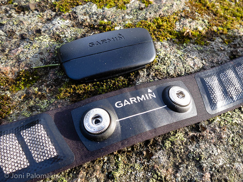
As for the accessories and peripherals, namely the HRM-Run included in the Performance Bundle, there is not much to be said, meaning they complement the fēnix 3 very well. HRM-Run is comfortable to wear, strap being sufficiently wide, and connection to fēnix 3 happens almost instantly, once an activity is started. Same by the way goes also for the GPS lock, being very fast, a lot faster than my Ambit3, taking typically mere seconds. And again, confirmation of the connection and GPS lock can be had as a gentle vibration. I would prefer to be able to change the battery on the heart rate belt without tools, but Garmin has chosen to secure it with 4 small screws instead.
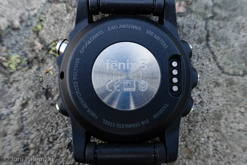
Sales package includes also USB charger and a kind of miniature docking station for the watch, connecting the device securely over USB, using the four-pin connector on the back of the watch. As with any proprietary connectors, I would prefer they come with detachable cable, to remove unnecessary bulk when securing power and connectivity on the go, across a wide range of electronics. I would however suspect this is not such a common requirement, and hence it is understandable yet another connector (and connection) is omitted, for simplicity and reduced BOM.
Overall I am very pleased with what Garmin has done with their latest iteration of fēnix series watches, packing lot of punch on a stylish, yet robust casing that you willingly strap around your wrist first thing in the morning. Paired with good quality accessories and peripherals, and the fully user configurable Garmin Connect, it leaves a little to be desired. With rather timeless design, and all the current and especially future functional and aesthetical enhancements from Connect IQ should help to keep the device fresh for a long time, and hence also one’s update zeal at bay for at least a tiny bit longer.
If you have any questions, post a comment below. I am happy to give more insight on any specific function or feature which you might be intrigued about.
